
Here’s a simple trick you can use on your blog to instantly see a growth in email subscribers.
Be warned, however, it’s not for everyone.
In fact, I’m predicting that a few of you might take issue with this type of technology (even though it’s really cool!).
It’s not illegal or anything like that… just a bit annoying, perhaps.
So what is it? Let’s take a look.
Why are you experimenting with annoying things?
Before I talk about the trick itself I just wanted to kind of pre-dig myself out of the hole I’m about to make.
One of my main goals here on Blog Tyrant is to save you time, stress and money by experimenting with marketing ideas so that you don’t have to. That was also part of the reason behind Blog Tyrant XPeriments.
So sometimes I’ll implement a new plugin or write a bit of software and see how it works because I want to pass on that information to you guys.
I really hate the idea of writing blog posts for the sake of it.
I’d much rather play around with new ideas and see if I can come up with something that benefits my business and then allows me to share it all with you.
And please note that I never do anything illegal or unethical. In fact, this experiment probably isn’t even as offensive as I’ve made it out to be.
How I doubled my email sign up rate with exit features
Let me start by saying that you always want more email subscribers for your blog.
It’s your email subscribers that protect you from Google updates, allow you to launch new products and websites, and help you promote every bit of new content that you produce.
If you want a longterm, sustainable business you want to be trying to grow that mailing list at all costs.
Okay so here’s what I’ve been trying:

If you visit Blog Tyrant for the first time (as in, you don’t have any cookies on your computer) you’ll see a pop up appear when you try to leave the site.
This is the bit that I think some people won’t like.
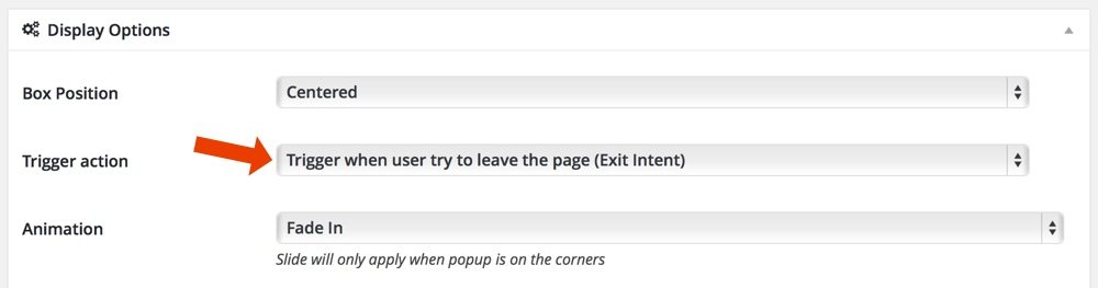
The pop up only appears when you put your mouse near the “back” button or the little “x” that closes the window. That’s called an exit intent.
I’ve set it up so that you can close the pop up easily by clicking anywhere on the screen, and it will never appear again, which helps me sleep at night.
This pop up doesn’t directly allow sign ups, instead I send people off to a landing page that I have been tweaking for a while and it currently converts at 50.4% since using this plugin – almost double what it did before.
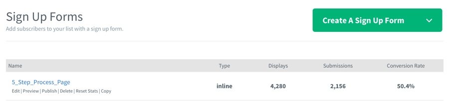
You can check out the landing page here if you want.
As you can imagine, having the best landing page possible is really important for this strategy.
How do you build this function?
There are many plugins that will allow you to achieve this effect but the one I use is a premium plugin called PopUps (not affiliate link).
I personally prefer using premium plugins because they are cheap, get better features and you always have the security updates and support from the staff if you need it.
Essentially with this plugin you just create a new popup much like you’d write a new post. You then style the design as you like it with their inbuilt options and set the exit intent as below.
There are many other features you can play with as well like restricting it to PCs only and ignoring mobiles.
I’m going to keep playing with different options and see if I can get any different/cool results that might be worth sharing. If you choose to try this out I’d really like to hear how you use it and what effect it has on your sign up rates.
Some important notes about this setup
I want to finish this post by giving you some important things to remember when playing with this type of setup.
- Your traffic sources matter
If you have the wrong traffic sources it won’t matter how good your tech setup is – people won’t subscribe. Always focus on getting more traffic from more relevant sources. - Your design matters
Make sure you spend a decent amount of time getting the design right and playing with it to see what converts better. Sometimes a few simple changes like color or call to actions can really change things. This is why we split test. - The user experience is vital
The user experience is so important. Please don’t use these things in a way that confuses people or is impossible to close. Don’t show it to regular readers every single day. It should be prevalent but still subtle and smooth to use. - More email subscribers isn’t the end
Remember that it doesn’t matter if you have 100,000 email subscribers if they don’t open your emails. This is why I don’t trick people and send them to a second landing page – it lets them analyse if they really want to get in on it. Keep a close eye on your open rates and see if they change. - Don’t be afraid
Don’t be afraid to try pop ups. Almost all of the big websites and blogs use them and many utilize and exit intent. Most readers don’t care a bit that you’re using one.
And always remember that what works for my site might not work for yours. This is yet another reason to make sure you pay attention to your results and keep testing.
Will you try it?
I’m really curious to know what you guys think about this type of popup. Will you give it a go? Or perhaps you’ve already tried it and have some results to share? Please leave a comment below and let me know.
Top photo © Maxsomma | Dreamstime.com.
No comments:
Post a Comment